Agency: Conway and Partners | Role: Creative Director
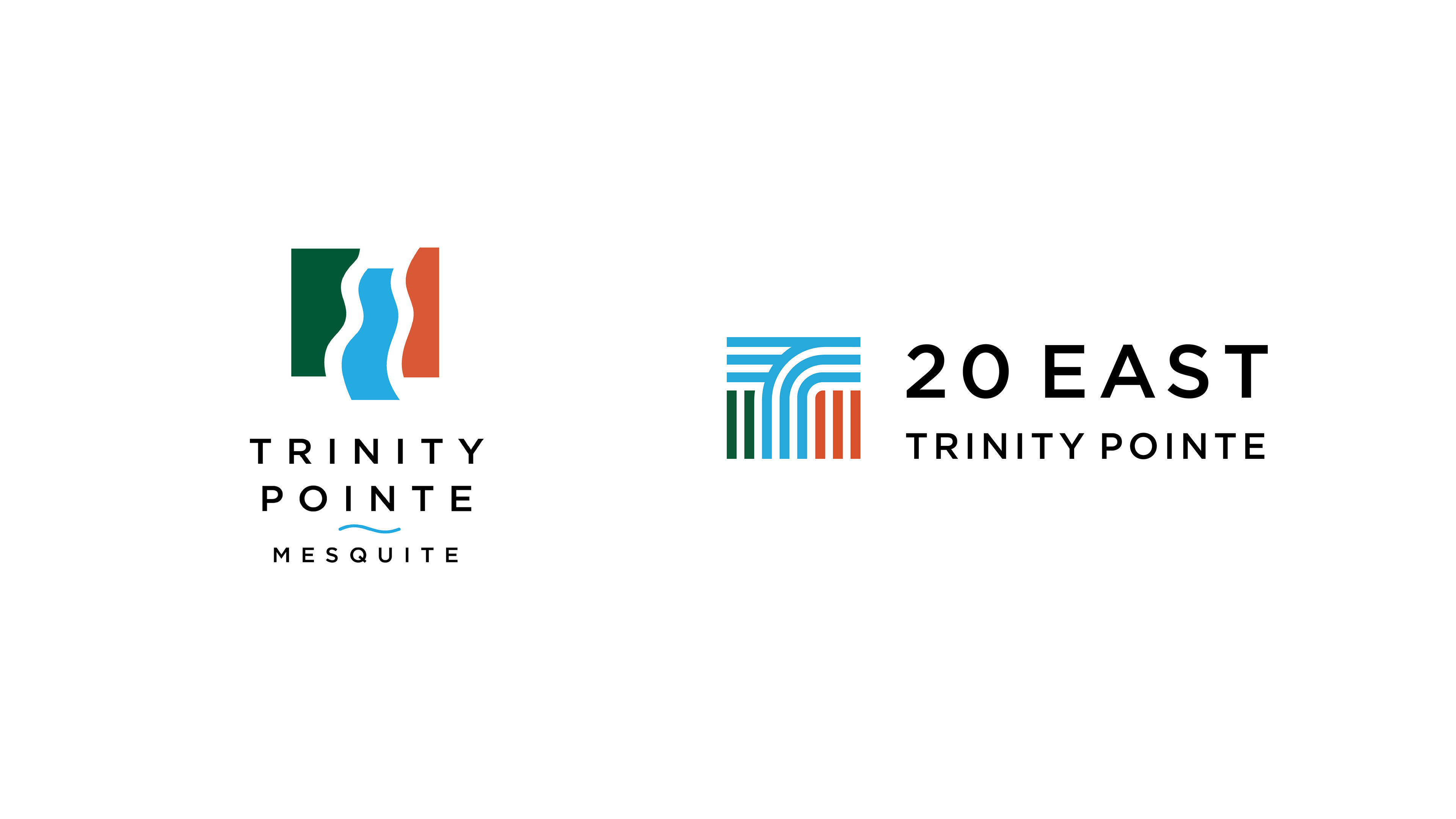
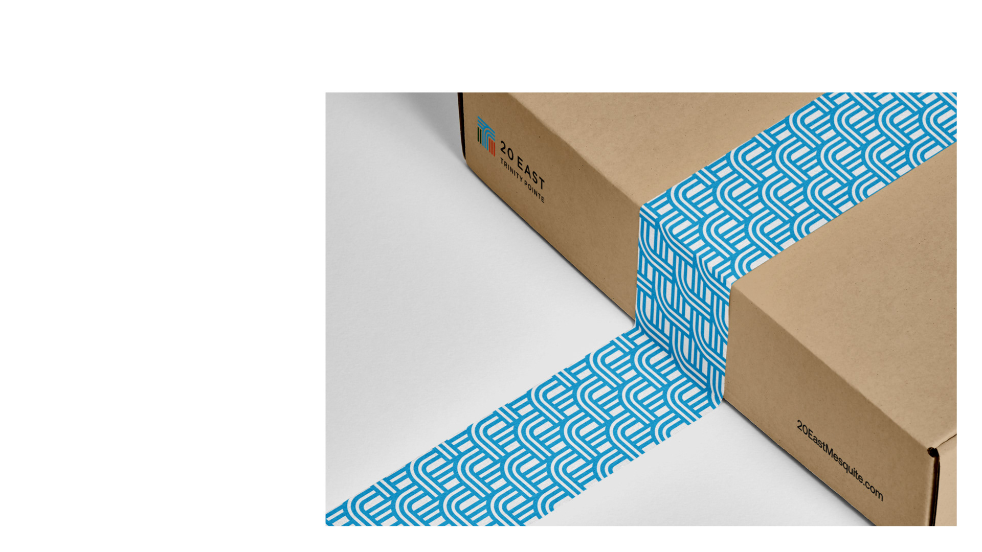
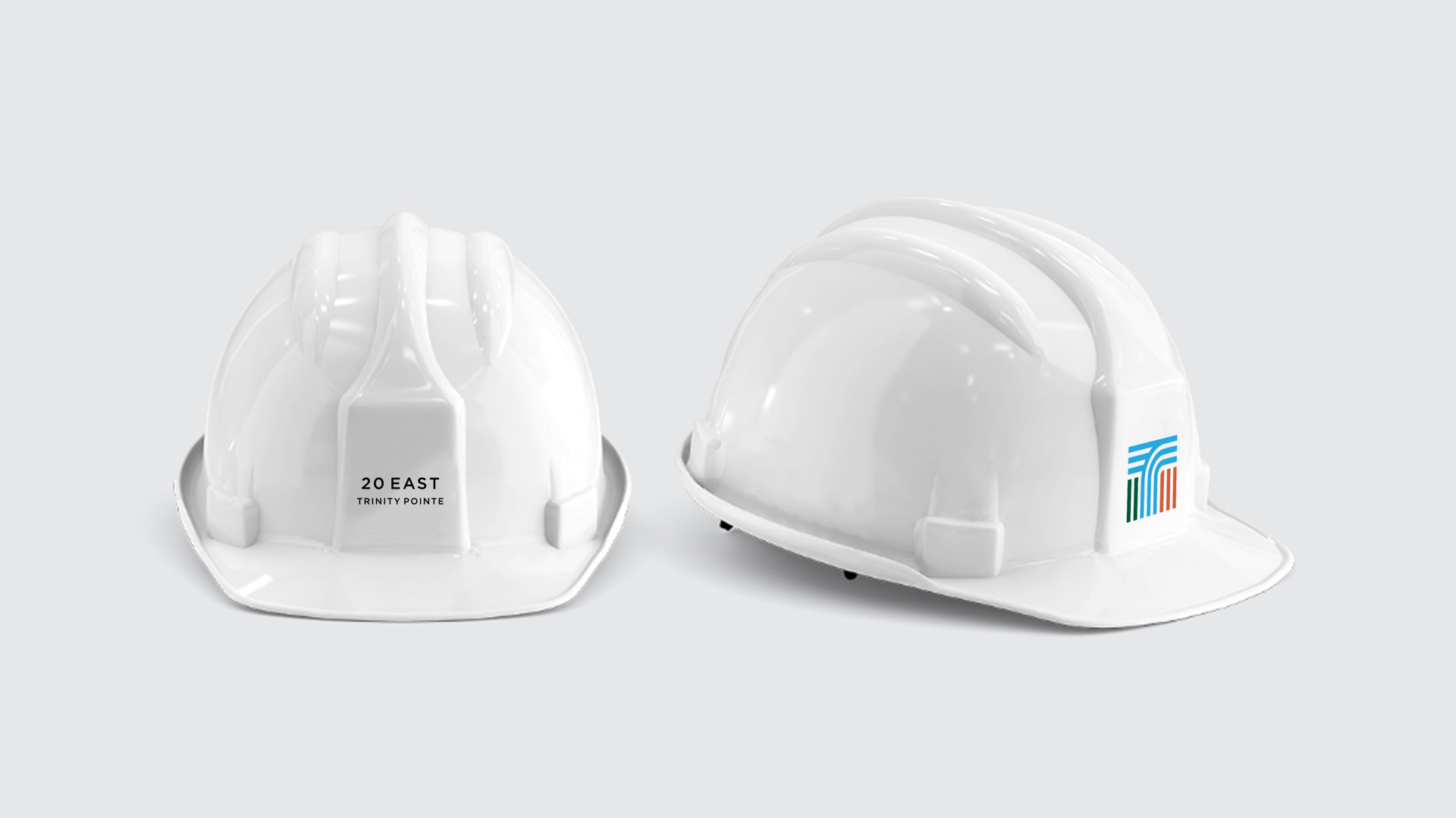
Highly connected to Dallas by 4 major interstates, we sought to highlight and draw inspiration from this convenient location. The 4 interstates are represented in the logo, forming the T, with each highway traveling in its respective direction.
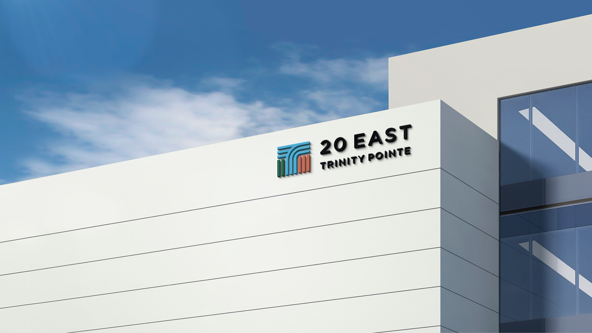
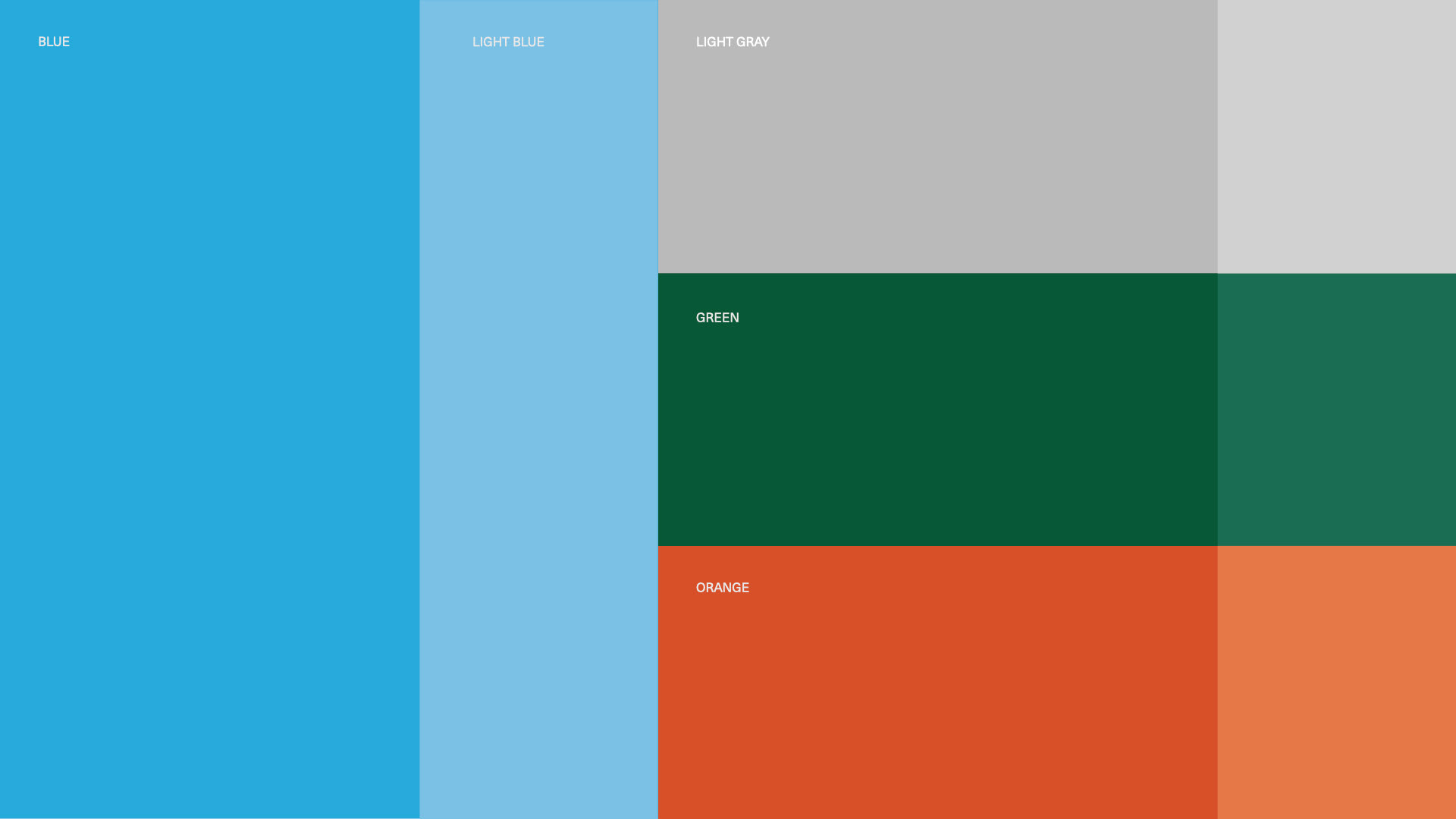
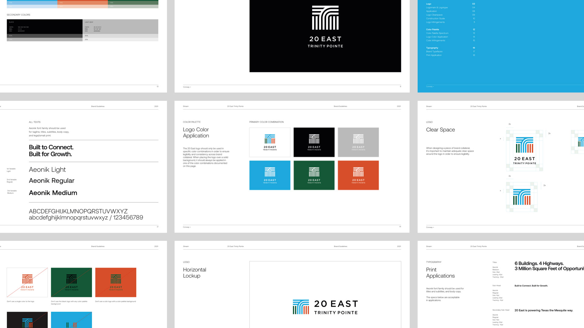
To further address the brief, the color palette was directly pulled from the Trinity Pointe logo to generate consistency and familiarity between the two brands. The two logos feature the same green, blue and orange colors in the same order. We also opted to use a similar geometric typeface to marry the two brands in harmony.

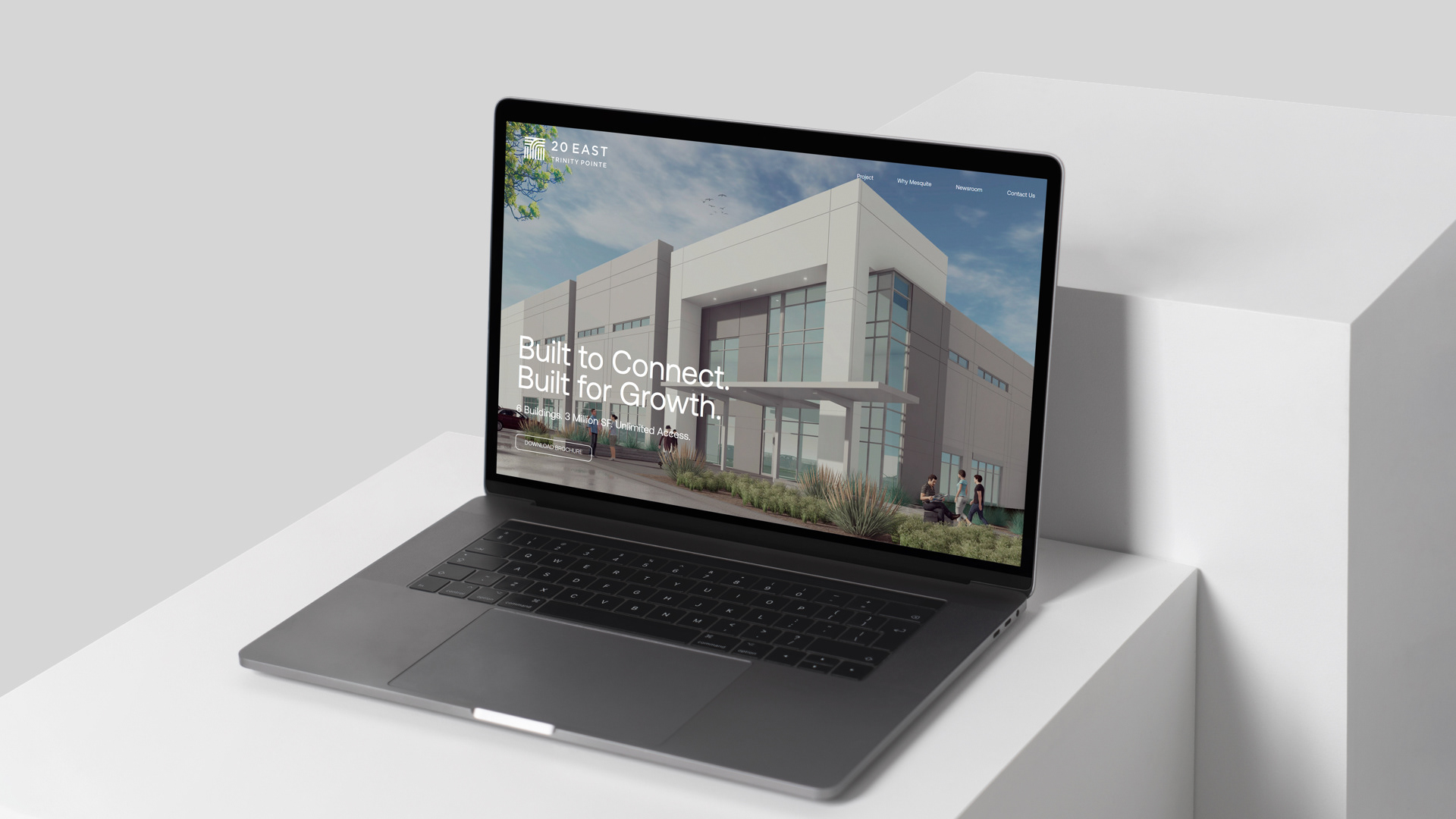
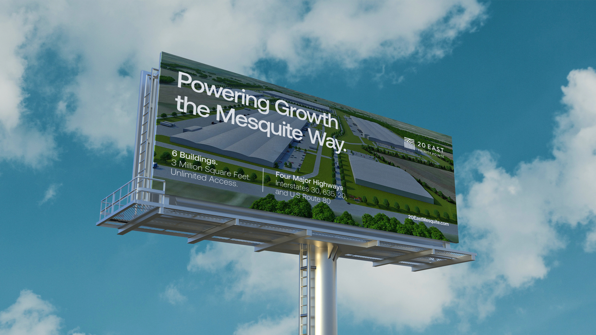
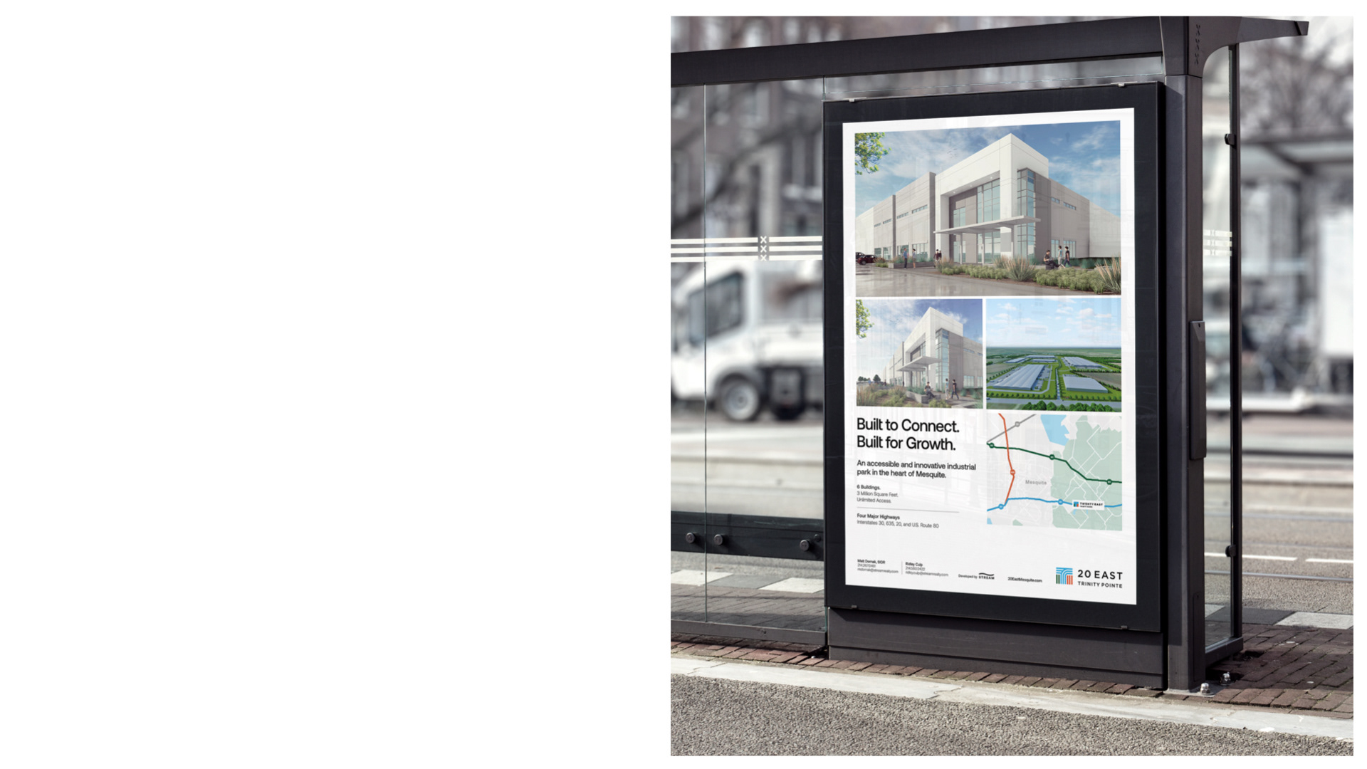
The messaging approach was simple and straightforward focusing on key drivers: innovation, location and growth opportunities.