Agency: Conway and Partners | Role: Creative Director
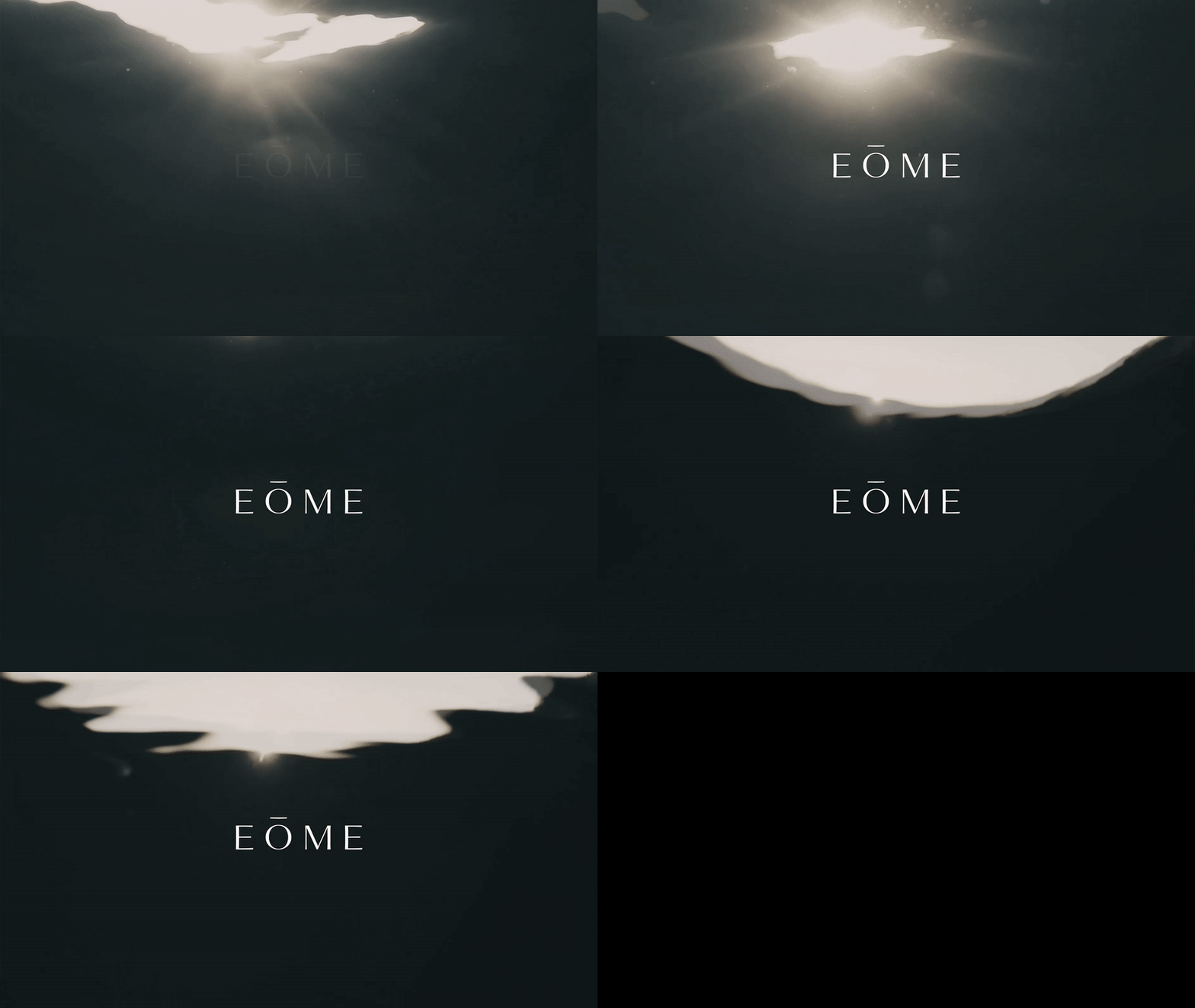
/AE · O · ME/
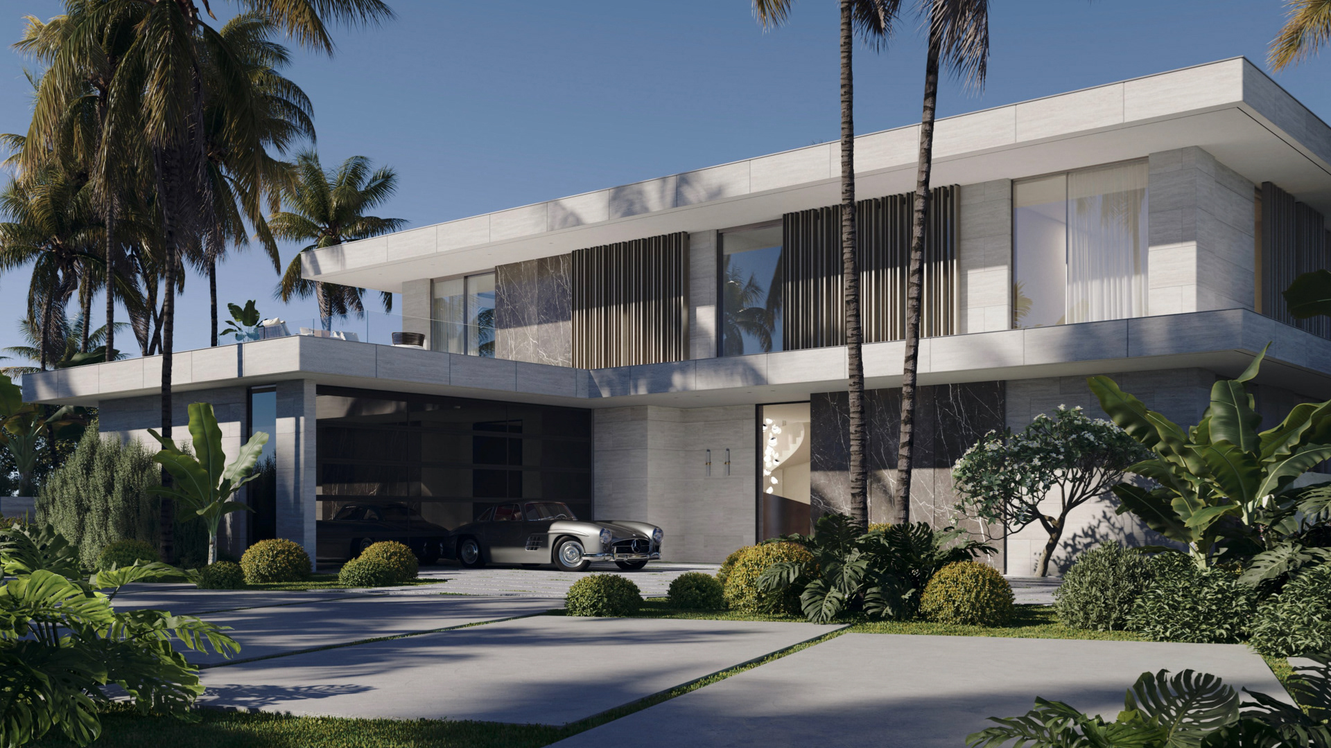
EŌME is derived from the word geometry. The name is referential of the villa's modern architecture and the philosophical origins of geometry as it relates to human constitution. Strikingly mathematical yet bearing a mysterious power, the essence of everything that surrounds and encompasses us, evoking a feeling as profoundly familiar as home.
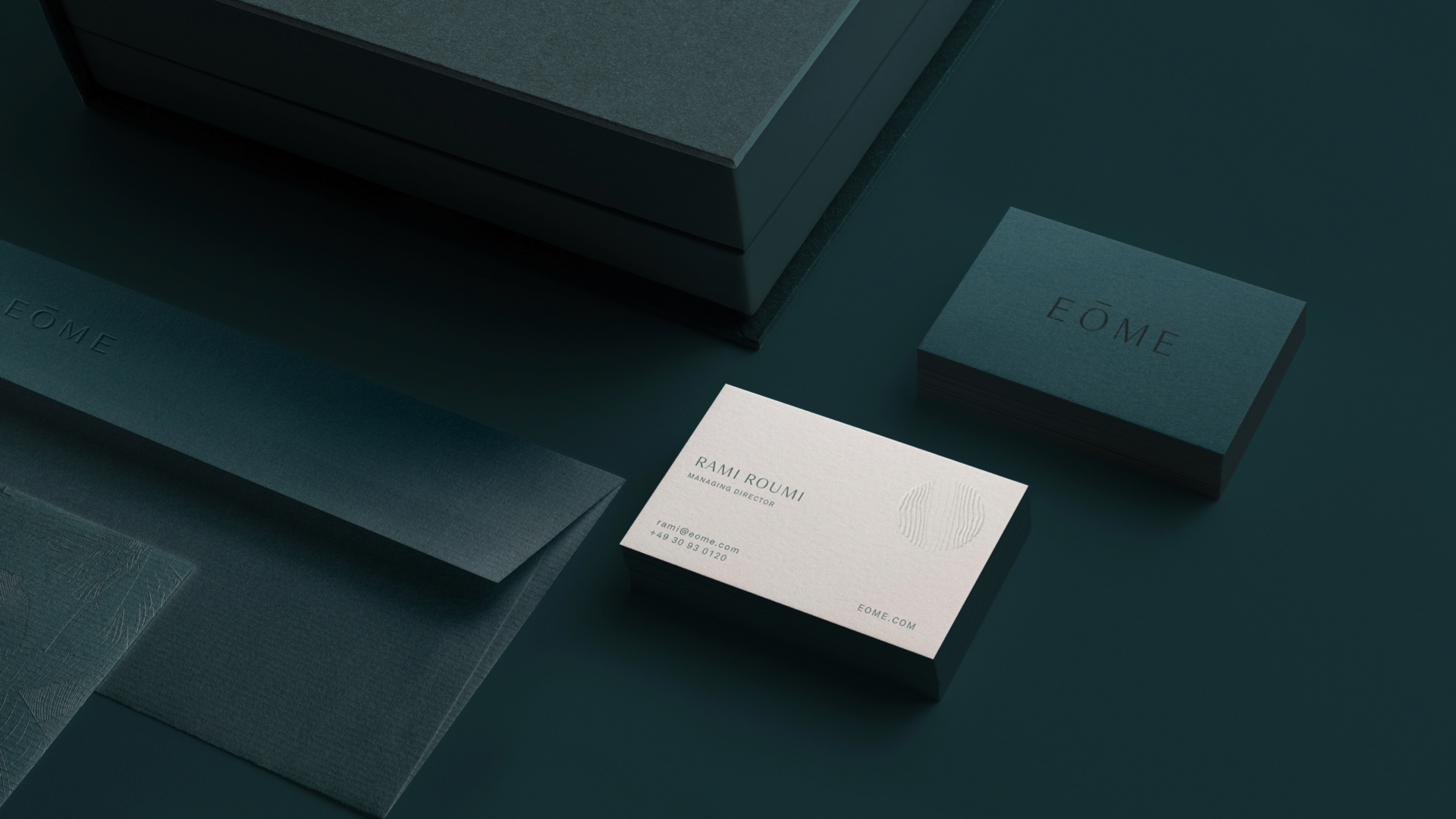
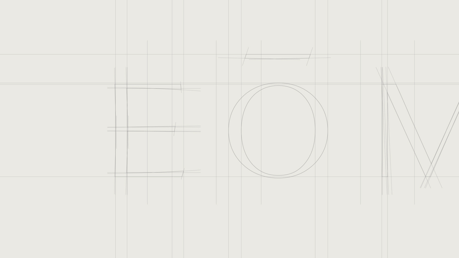
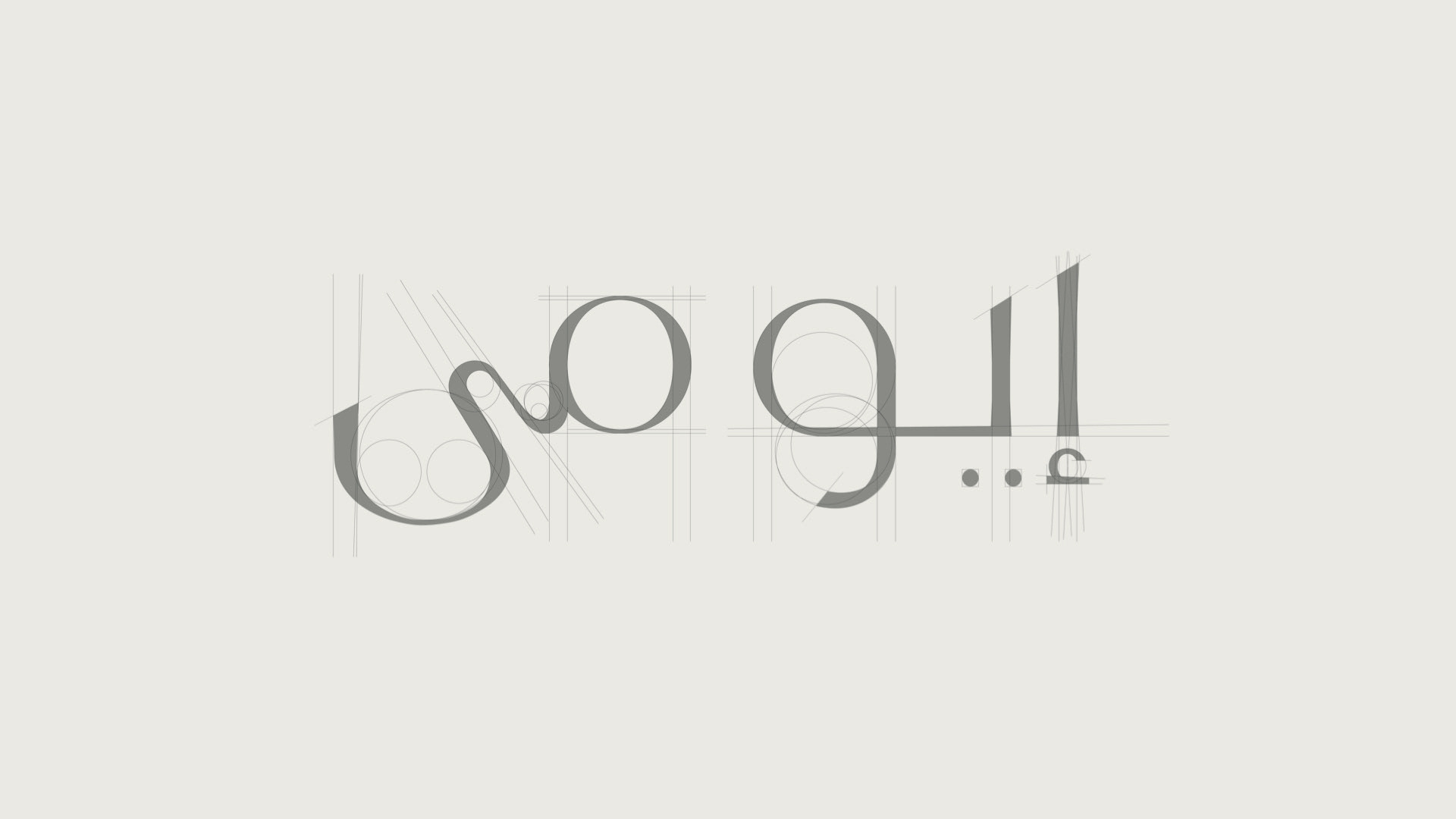
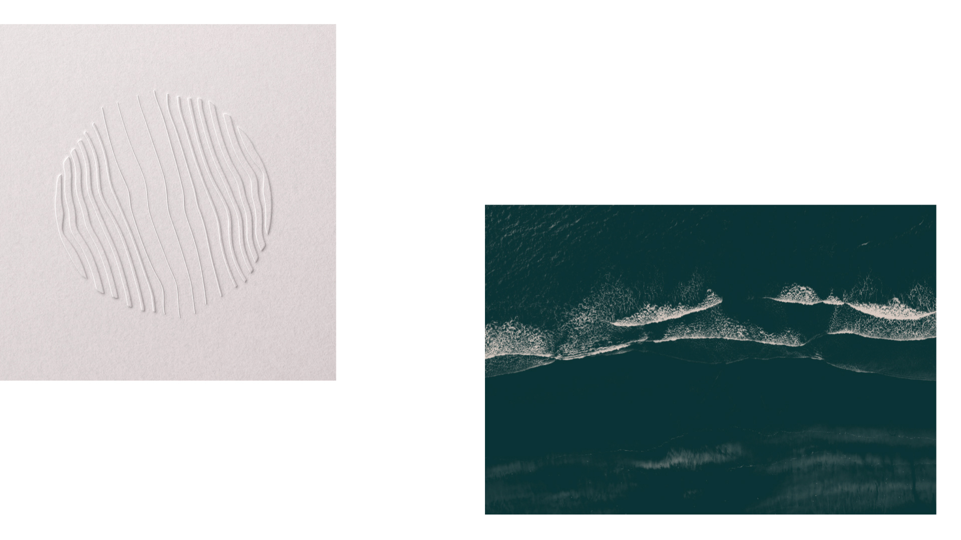
Rippling sands inspired the logo icon, representative of an organic geometry. The customized logotype in both English and Arabic strikes a balance between curved and straight geometric forms.
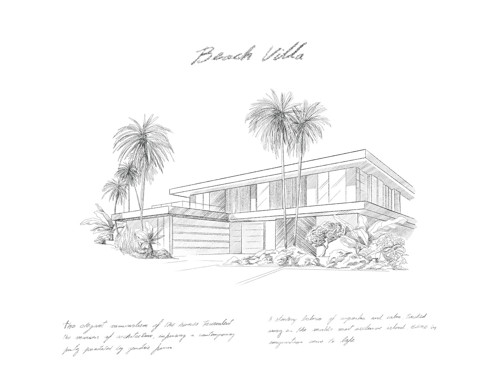
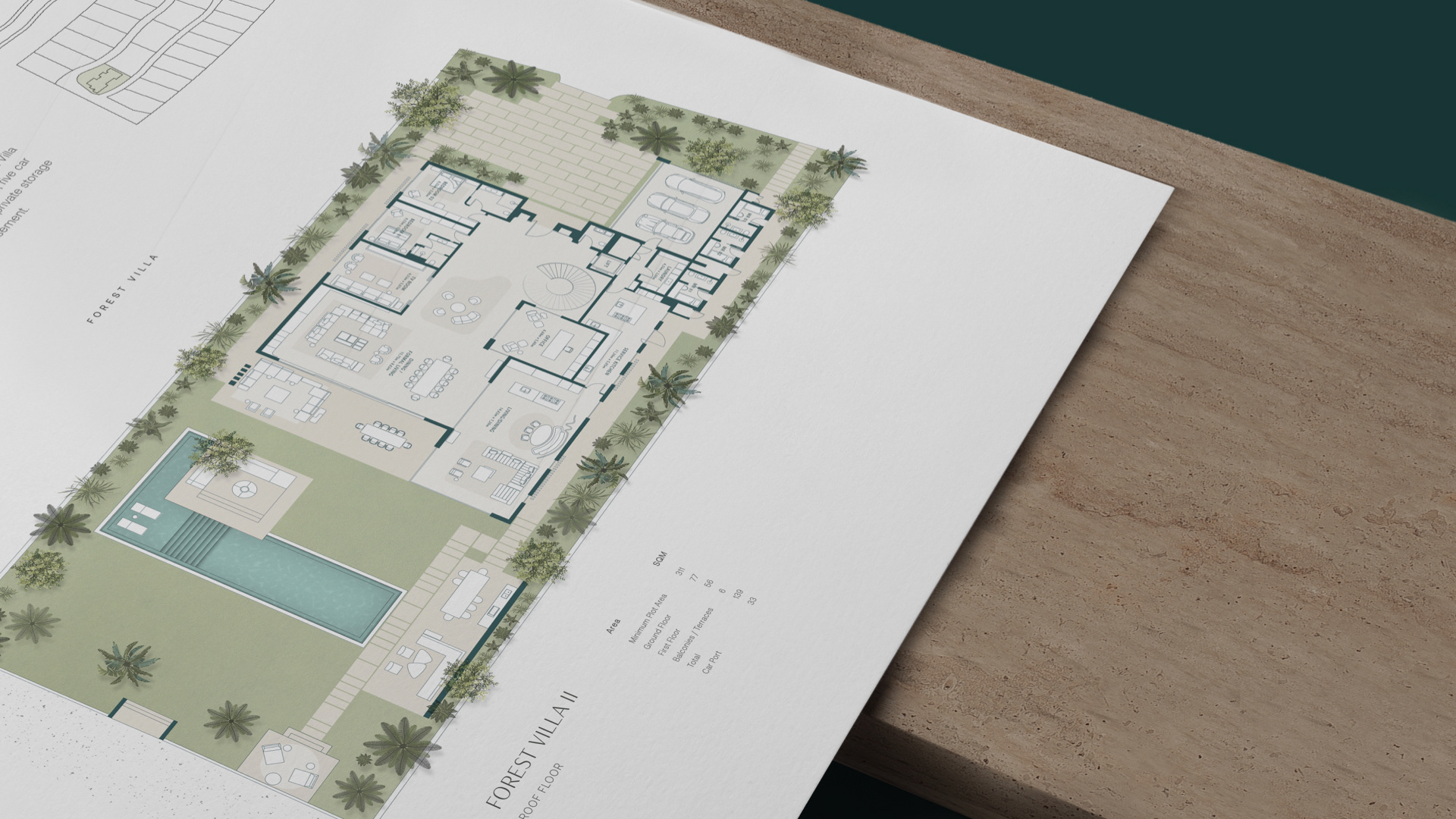
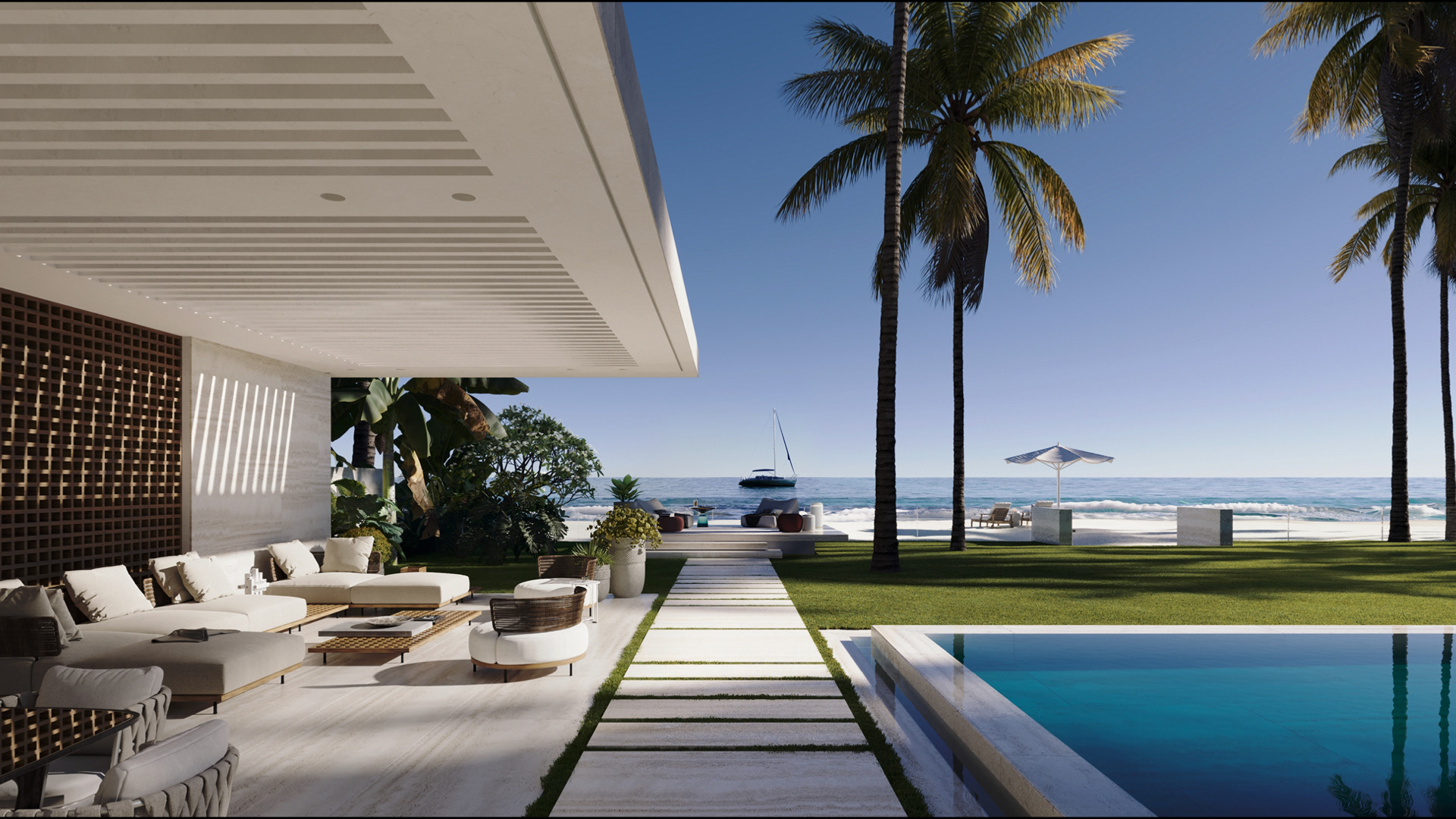
Conceived by a world-class team of designers, architects and engineers working in harmony with their setting, the concept is built on a foundation of simplicity and an openness to the surrounding Maldives-like landscape that erodes the division between indoor and outdoor spaces.
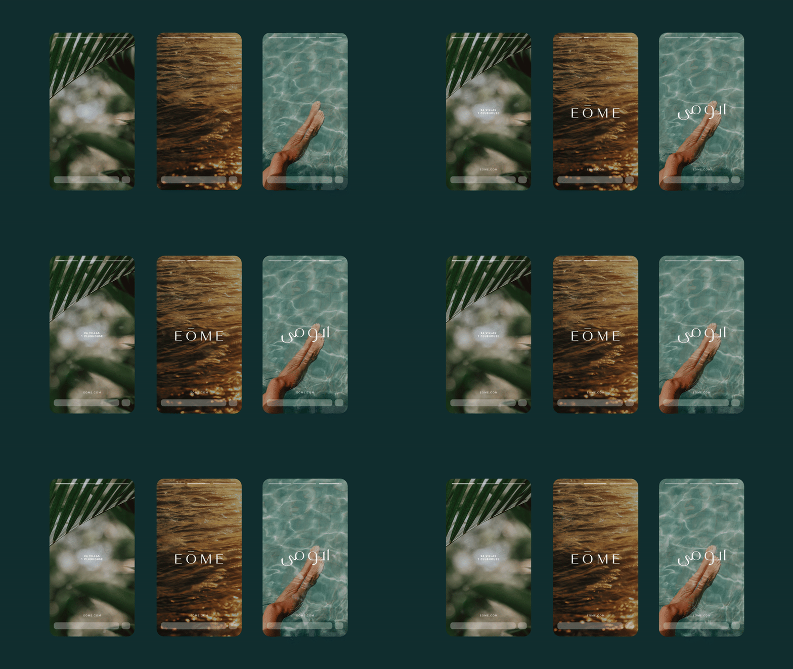
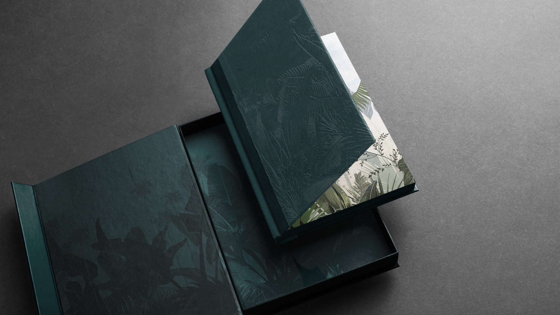
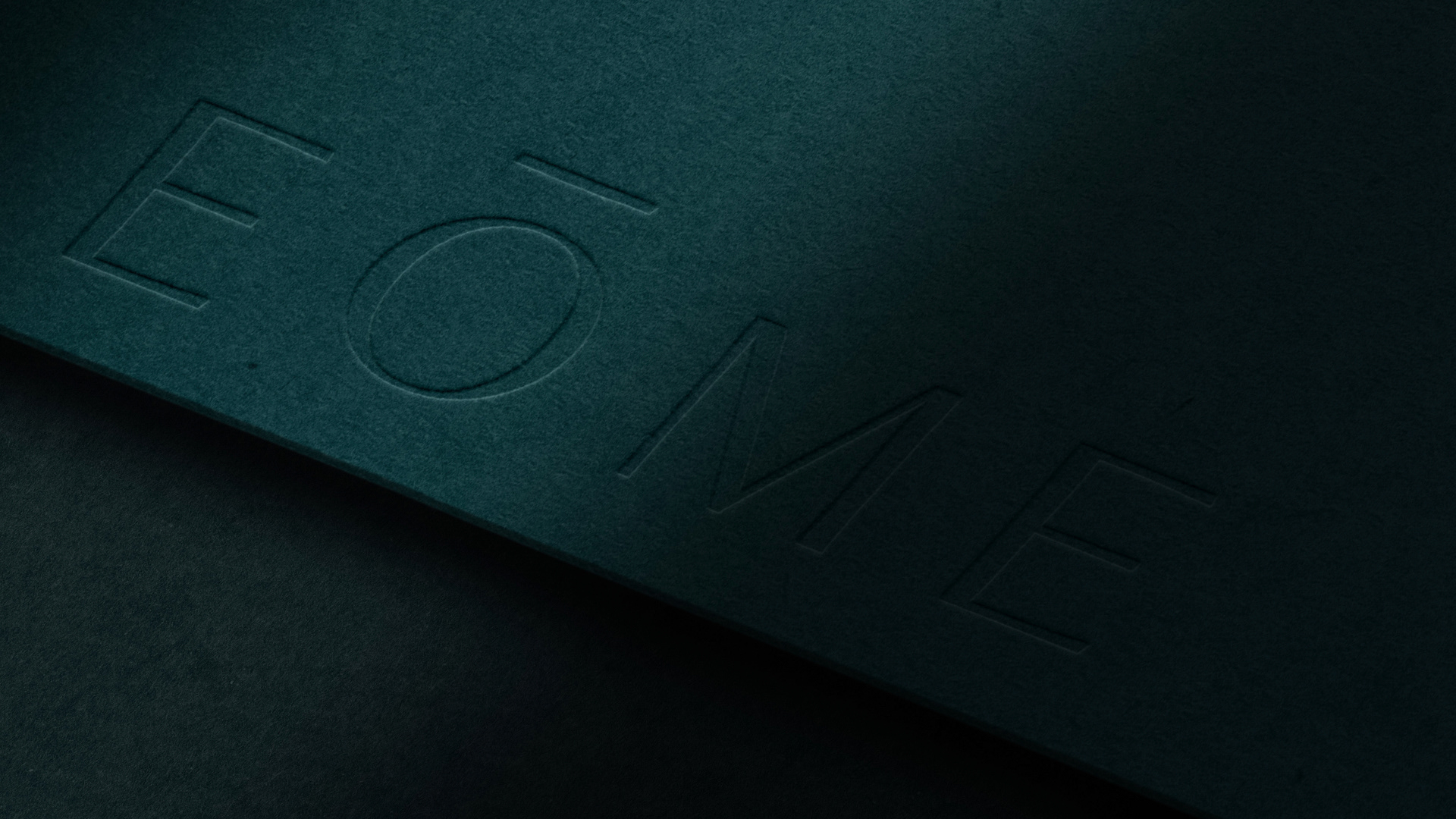
We worked to maintain a sense of mystery and elegance throughout all collateral. Precise detail and textures delicately shine on the highest quality materials, and appear nearly hidden in plain sight - just like EŌME and its surrounding landscape.