Agency: Conway and Partners | Role: Creative Direction

Inspired by the likes of Müller-Brockmann and Massimo Vignelli, the Vanguard logo is a mark of functional simplicity. It is derived from 3 variations of the V that form a distinct triangular and hexagonal shape. Sturdy and symmetrical, the icon acts as a symbol of trust and quality assurance. It can be scaled, cropped and abstracted, offering added visual interest and graphic hierarchy.

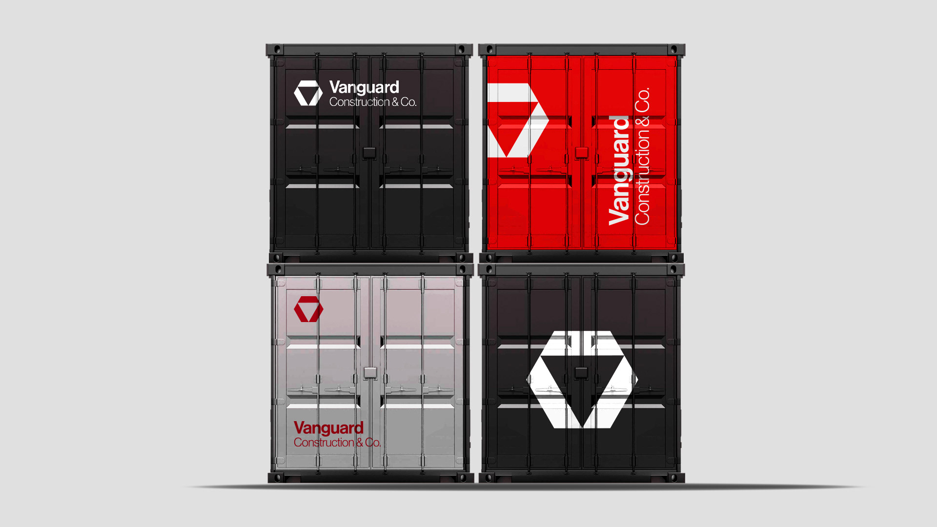
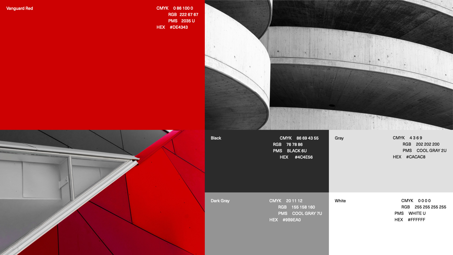
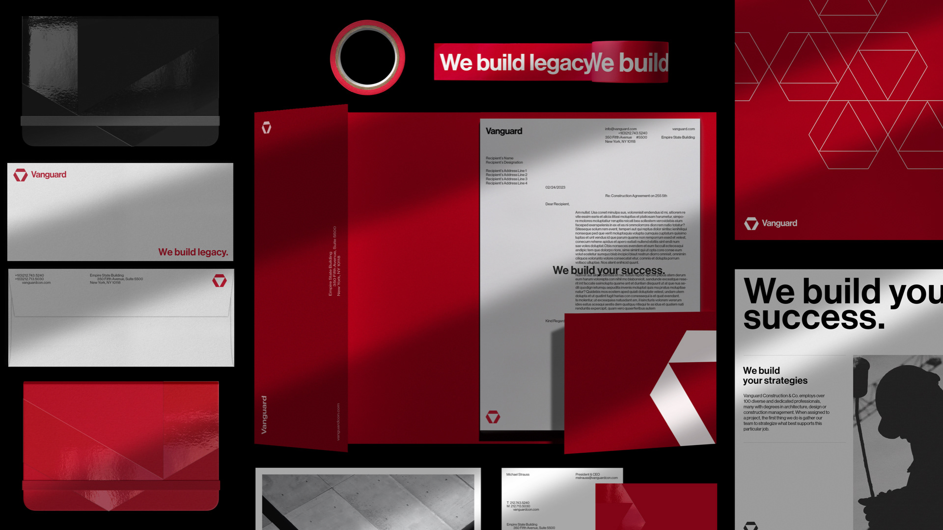
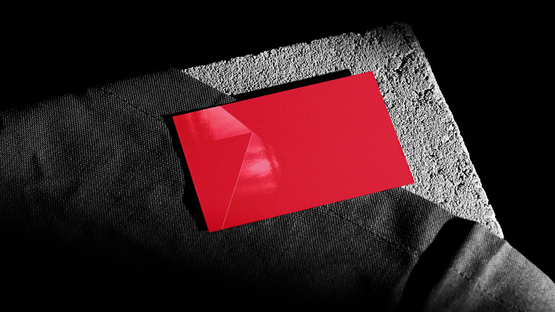
The brief had only one requirement, maintain the Vanguard Red 2035U, that has defined the brand since inception. With that in mind, we wanted the crimson hue to be the star and opted to play with foils and finishes that added a subtle shine, meanwhile keeping secondary colors neutral - playing off the brutalist and austere nature of construction materials.